New identity.
The logo was the only existing element when the project began. It is based on the profile of a lion, with the shape of the African continent at the tip of its tail, and a smoking bell at the base of its paws. The brand name TAMBA (short for the village of Tambacounda, Senegal) appears.
The Tamba typography was created especially for the brand. It is made up of bold typeface, and is used primarily for the names of prepared dishes, as well as for the hashtag #eatwithtamba.
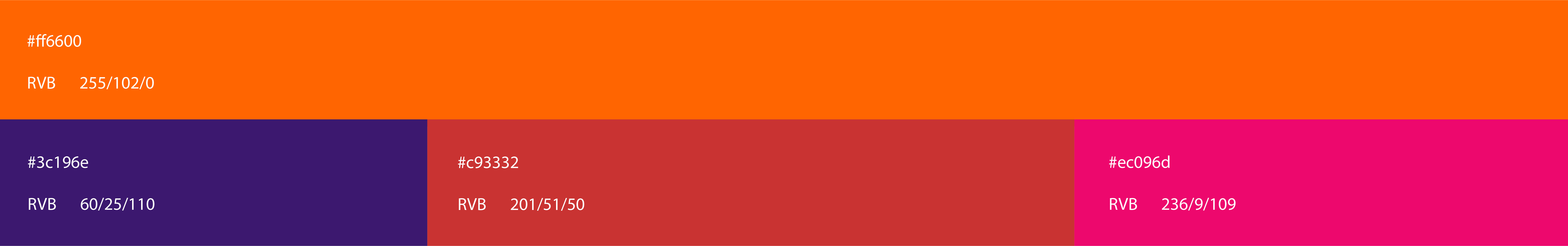
Orange is one of the founding elements of Tamba's identity.